REBRAND/ART DIRECTION
With an ever-growing wine portfolio, the Mark Herold brand needed a cohesive look and an increase in brand awareness. It was important to stay true to the winemakers' freehearted spirit and big personality.
The Challenge:
Winemaker Mark Herold was looking for a way to position his wine brand that was true to his exuberant and fun-loving spirit while building brand awareness. The issue was how to bring all the labels under one brand without disrupting the current label artwork and overall brand esthetic.
The Solution:
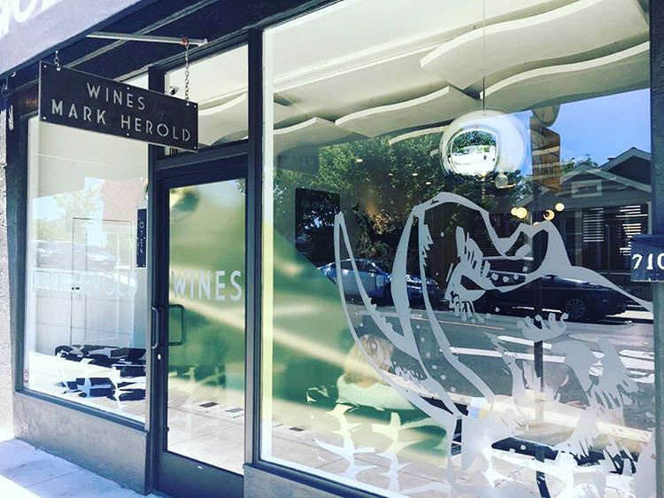
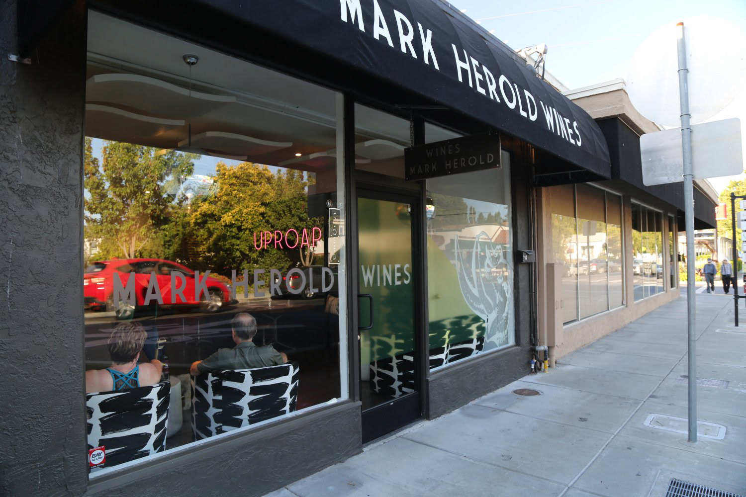
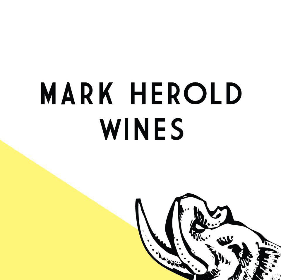
Pivoted existing artwork as the logo icon of the new brand name, Mark Herold Wines. I pulled complementary colors from the existing labels to refine a color palette for the new brand. The brand now encompasses the fun-loving spirit by keeping all the artwork as well as a new clean logotype treatment across all branding. I loved creating the visual narrative of Mark Herold wines especially the branded environmental design of their tasting room which has seen a jump in walk-in foot traffic.
Pivoted existing artwork as the logo icon of the new brand name, Mark Herold Wines. I pulled complementary colors from the existing labels to refine a color palette for the new brand. The brand now encompasses the fun-loving spirit by keeping all the artwork as well as a new clean logotype treatment across all branding. I loved creating the visual narrative of Mark Herold wines especially the branded environmental design of their tasting room which has seen a jump in walk-in foot traffic.
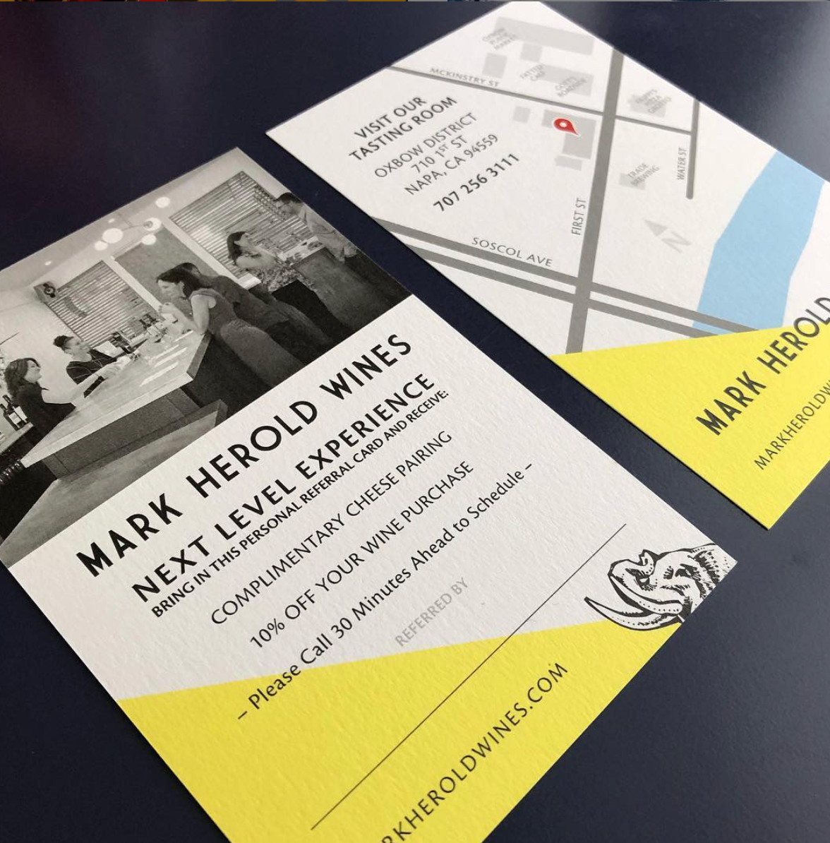
New logo mark
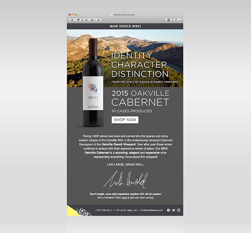
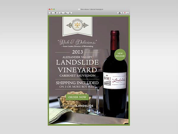
Printed map, exterior window graphics and email marketing